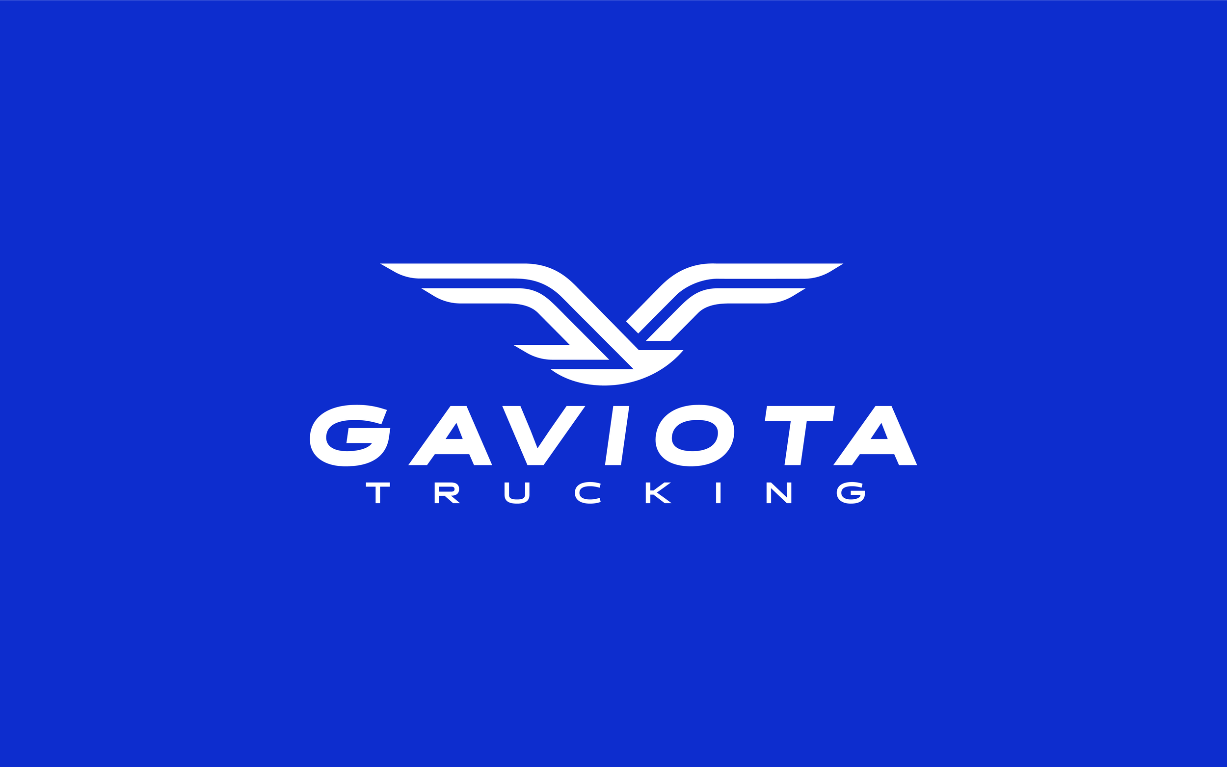
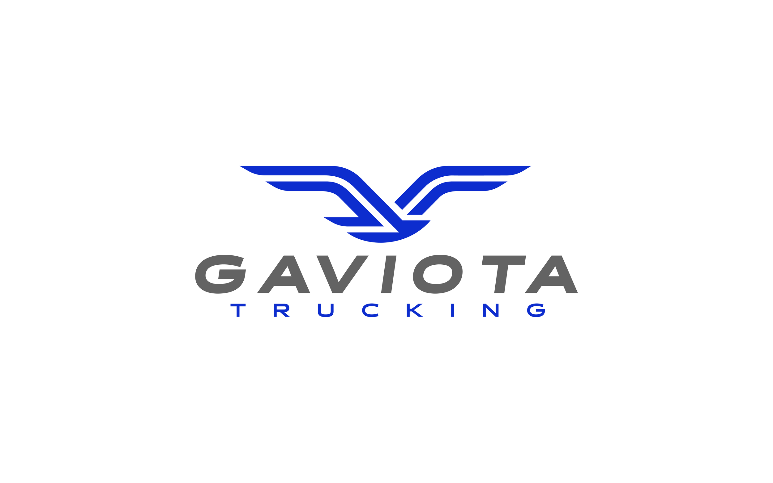
Gaviota Trucking
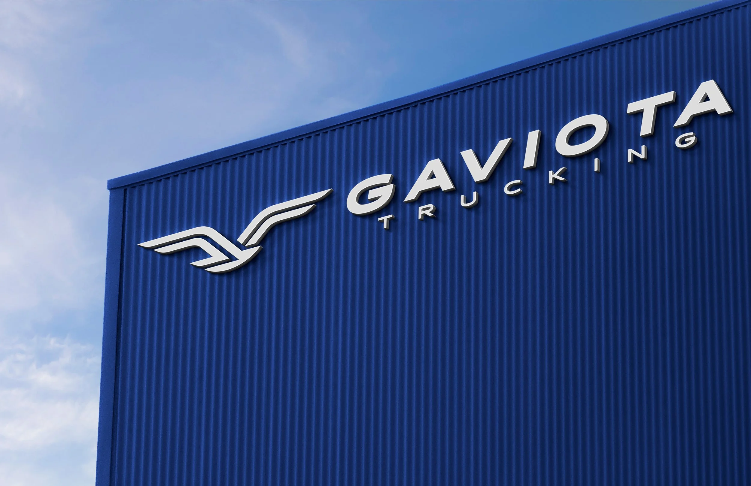
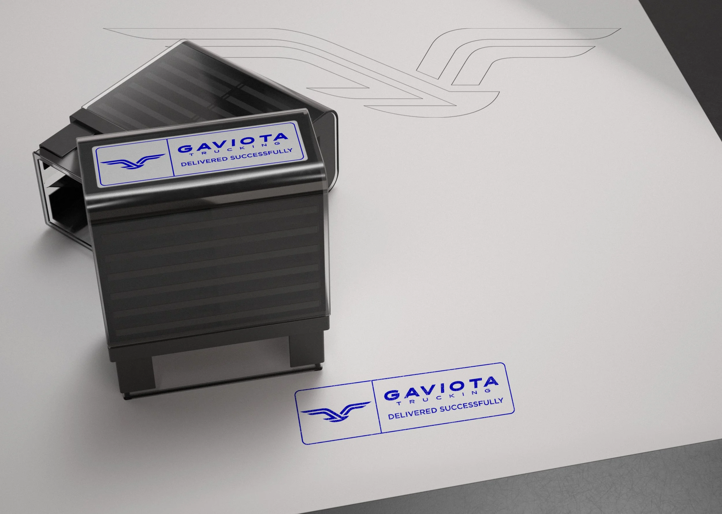
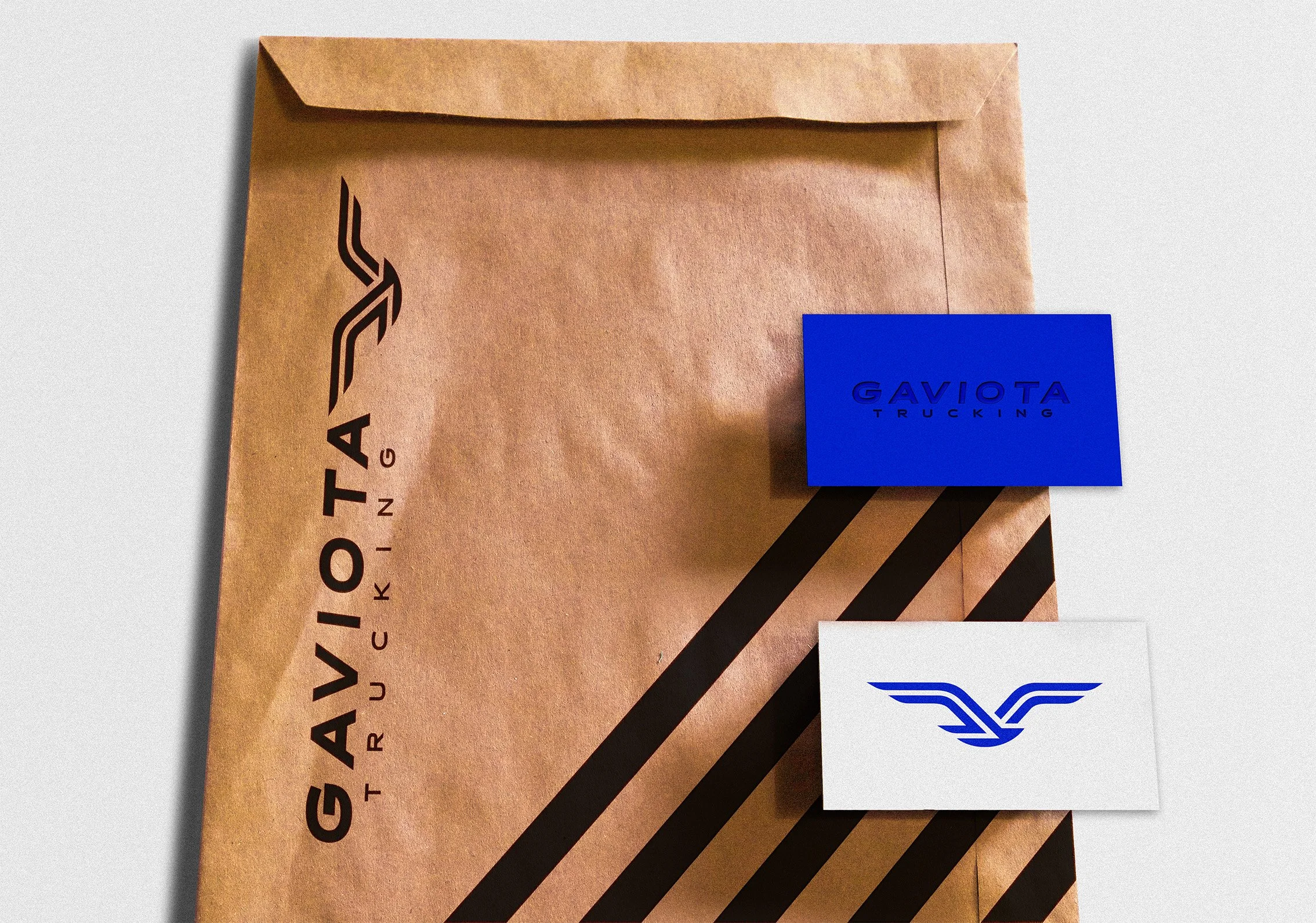
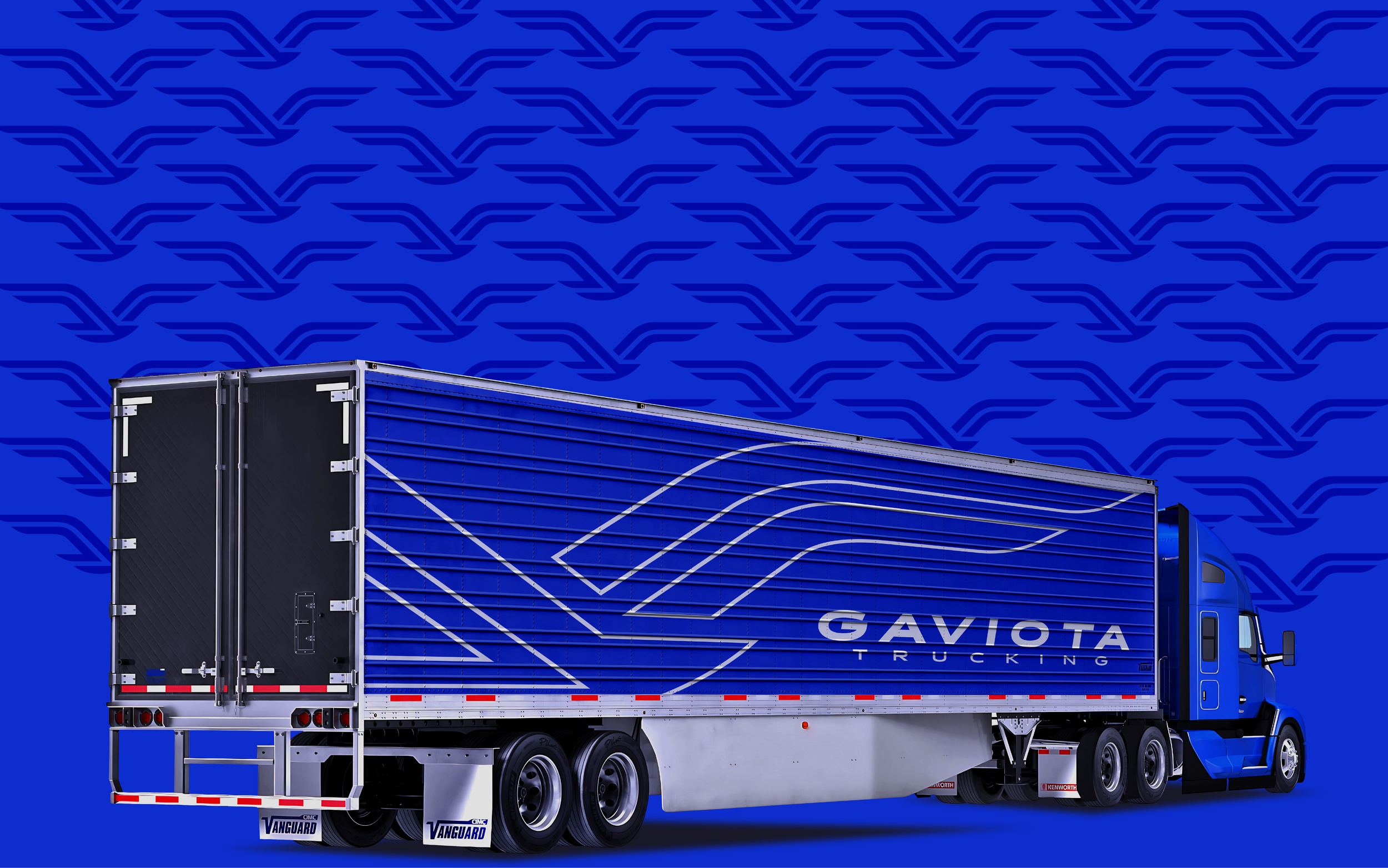
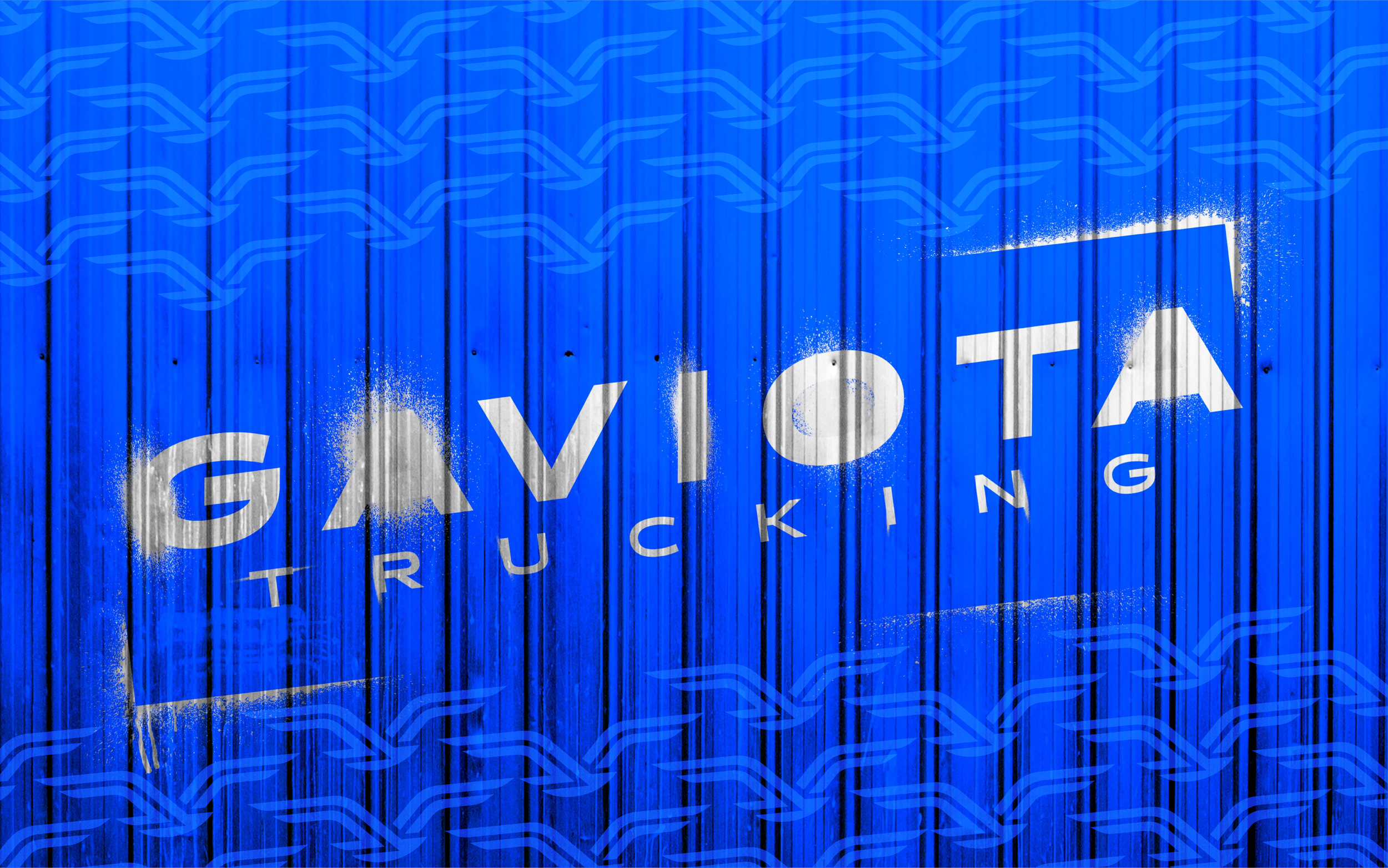
Logo concept: a silhouette of a seagull in flight fused with a road line stretching to the horizon. The seagull brings freedom, vigilance, and navigation; the road provides direction, efficiency, and constant movement. Together they create a brand that communicates freight capacity, safe transit, and leadership on local routes.
Color strategy: blue is the primary color. It operates on several levels: as a symbol of trust and professionalism expected in transport; as a cue for cleanliness and precision—vital for a company that enforces high standards; and as a metaphor for sky and sea, tying back to the seagull and the sense of scale in logistics. Brighter blues suggest speed and modernity; darker shades reinforce seriousness and reliability.
Sustainability and trust:
the design signals environmental commitment through low-impact iconography and a visual tone that implies cleanliness and responsibility. Proposed materials and finishes for vinyls and stationery prioritize recyclable options and lower‑footprint processes. Overall, the brand visually conveys operational safety, punctuality, and respect for routes and communities.